Designing letterhead: Your guide to making a professional impression
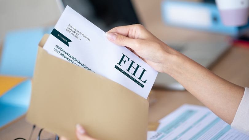
Why good Letterhead – so important Why? Because first impressions count. There are countless ways to make your stationery stand out from the crowd and, what’s more, leave a professional and unique impression. How? With high-quality stationery by drucks.ch and our helpful tips.
1 | When and where stationery really pays off
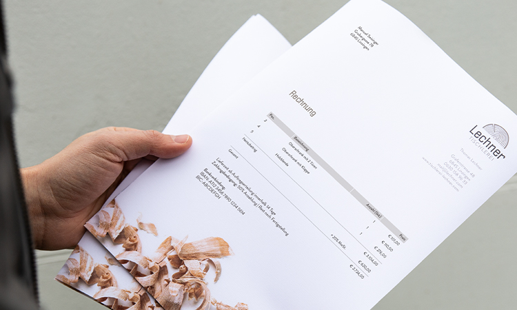
Letterhead is extremely versatile. Whether in the Business communication or to the Strengthening customer loyalty – matching stationery is essential and a A must-have for businesses. Whether it’s for initial contact with potential customers or for ongoing communication within existing business relationships – well-designed stationery helps to, Information presented clearly and effectively to convey. Even in a world dominated by digital communication, stationery remains a powerful way to stand out and be remembered.
The most popular uses for stationery
- Business letters
- Invoices
- Offers
- Contracts
- Reminders
- and many more ...
drucks.ch tip: Would you like to send out customised mailings, addressed form letters or personalised promotional mailings? With our professional Mailshot services (Available in Austria only) We offer you bespoke printing and dispatch solutions. Discover them now!
2 | Good design is half the battle: The layout of letterhead
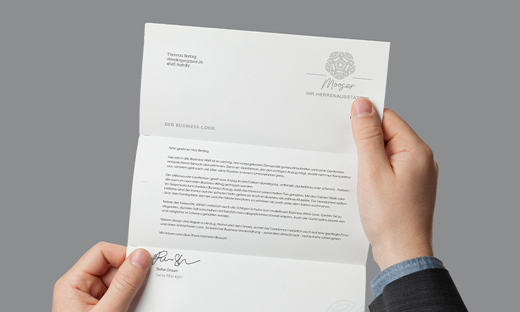
The layout of the stationery section follows a clear structure that incorporates both the Design and legal requirements are equally met. The same applies here: Form follows function – The design should look professional and emphasise the brand identity without compromising readability or functionality. This turns stationery into a powerful communication tool that reflects your corporate design.
What matters when it comes to professional stationery
- At the top, there is usually the Company logo, which is often followed by a Slogan or basic contact details such as address, telephone number, email address or website.
- The central section remains for the actual correspondence is reserved and adapted to common standards such as DIN 5008 – so that everything is where it should be. You can find out more about the specifications in the next section.
- The lower section often contains Further information such as company registration number, bank details or legally relevant information regarding the company’s registered office and management.
drucks.ch tip: With a consistent design, you remain flexible – so you can easily adapt your stationery to different purposes using a suitable template.
3 | Please note these dimensions
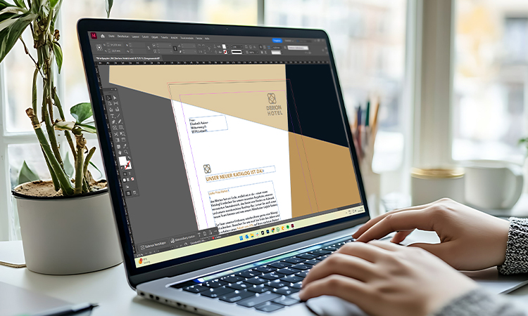
The Structure of the letterhead is based on the DIN 5008. Among other things, this standard specifies where the address field, text field or footer should be placed. This prevents the text from overlapping a fold line, whilst ensuring that the Address clearly visible in the field of view appears on the envelope.
To ensure the overall look is perfectly coordinated, you can of course also matching envelopes Have them designed and printed – to match your stationery and with a bespoke design.
Key dimensions
- Margin: 45 mm from the top edge of the page and 20 mm from the left edge of the page.
- Fold marks: 105 mm and 210 mm from the top edge of the sheet.
- Perforation mark: 148.5 mm from the top edge of the sheet.
- Text box: 98.46 mm from the top edge of the page, 25 mm from the left edge and 20 mm from the right edge.
4 | Our design tips for creating your designs
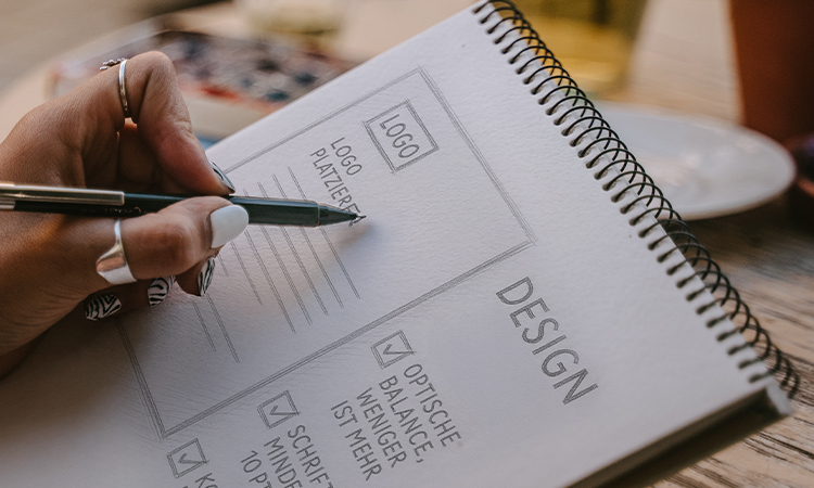
When designing stationery, the following applies: Less is often more. Ensure a clear, well-organised layout that reflects your brand identity – ideally through the targeted use of Logo, corporate colours and typefaces. With sparing use of design elements such as lines, shapes or icons, the Content highlighted without distracting from them. It is also important not to underestimate the need for sufficient White space. This ensures Clarity, readability and a balanced Design, by structuring the content and avoiding an overloaded visual impression.
In a nutshell: the key points
- Corporate colours: Use colours that match the corporate identity and adhere to company guidelines.
- Readability: The font size should be at least 10 pt to 12 pt to ensure good readability. Also, opt for sans-serif fonts and avoid italics in body text.
- Visual balance: As I’ve already said – less is more. Leave plenty of white space and stick to just a few colours so that your stationery doesn’t look cluttered or overwhelming.
- Refinements: To stand out from the crowd, you can add distinctive touches with various finishing options such as Special Pantone colours, HKS special colours, or Gold and silver colours set.
5 | Choosing the right paper: For a letter with style
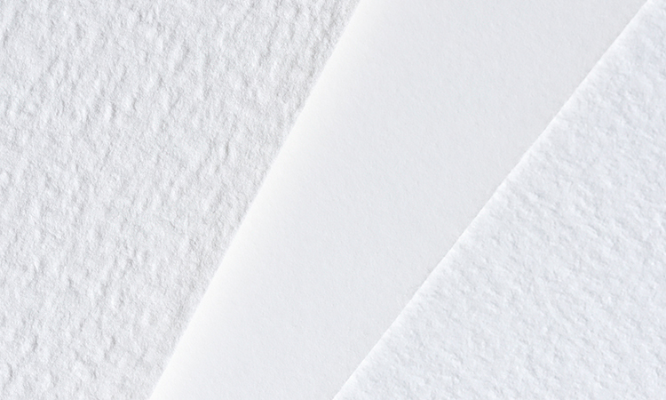
The various Types of paper have different characteristics. An important benchmark here is the Grammage, i.e. the weight per m². The rule is: the higher the grammage, the more premium the feel. Premium papers generally have a higher grammage. Depending on whether you wish to emphasise professionalism, creativity or sustainability, you should pay attention to the grammage, feel and surface finish. This way, you can make a compelling impression with the right look and quality for the intended purpose.
These paper types are available to you
- Bulk paper: Pure bright white, wood-free (low lignin content, therefore retains its whiteness for a long time).
- Recycled paper: Made from 100% Austrian recycled paper and chlorine-free.
- Premium Munken: High-quality, creamy white paper, which is also wood-free and chlorine-free.
- Premium Felt: White with a classic felt-like texture; free from wood, chlorine and acids.
Make an impression with the right stationery
Whether classic, modern and minimalist or particularly creative – well-designed stationery makes an impression and highlights your brand or personality. With a well-thought-out design, the right choice of colours and the right paper, every letter becomes a small statement. Take the time to personalise your stationery – it pays off when your letter makes a positive impression the moment it’s opened.